Vue.js Component Composition with Slots
In the previous post we introduced the Vue.js component model and saw how to pass data to
child components via props and how components can emit events up their parents.
In this chapter we focus on slots which give your components even more flexibility by injecting content into child components.
For this chapter we use a modal dialog as an example.

Slots as Content Placeholders #
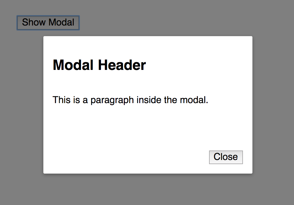
We start with the smallest possible modal dialog implementation where the rendering of the modal is done using a v-if directive with the showModal variable.
new Vue({
  el: "#demo",
  data: {
    showModal: false
  }
});
The showModal value is set to true on button click:
<div id="demo">
  <modal v-if="showModal" @close="showModal = false">
    <h2>Modal Header</h2>
    <p>This is a paragraph inside the modal.</p>
  </modal>
  <button @click="showModal = true">Show Modal</button>
</div>
Our modal component children consist of some example HTML heading and paragraph we'd like to show inside the modal dialog.
Additionally, we listen to the @close event in case the user closes the modal dialog by pressing the close button.
Let's have a look at the component:
<template id="template-modal">
  <div class="modal-background" @click.self="$emit('close')">
    <div class="modal-container">
      <div class="modal-body">
        <slot></slot>
      </div>
      <div class="modal-footer">
        <button @click="$emit('close')">Close</button>
      </div>
    </div>
  </div>
</template>
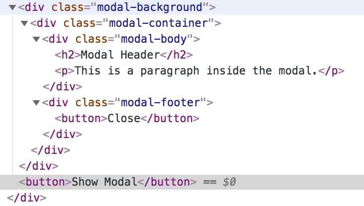
The modal-body contains a slot component which acts as a placeholder for our content we passed along above. It will not be visible in the browser DOM and will be replaced with our content.

The modal-background class used to render a darkened overlay underneath the modal dialog. Additionally, it emits a click event to close the dialog. The self event modifier is used to make sure the event is only emitted when clicking the background and not when clicking the modal dialog itself.
Named Slots #
In our previous example we used the "default slot" to pass along all content to our modal component. In the next example we improve the modal dialog component further by using "named slots" which enables users of the component to inject content in multiple places.
In order to become more flexible, we introduce named slots for the header, body and footer. Here is the definition of our markup:
<template id="template-modal">
  <div class="modal-background" @click.self="$emit('close')">
    <div class="modal-container">
      <div class="modal-header">
        <slot name="header"></slot>
      </div>
      <div class="modal-body">
        <slot name="body"></slot>
      </div>
      <div class="modal-footer">
        <slot name="footer">
          <button @click="$emit('close')">Close</button>
        </slot>
      </div>
    </div>
  </div>
</template>
Note the usage of the name attribute for each slot and how each slot is wrapped in another div element. The component has complete control of the styling by using specific CSS classes modal-header, modal-body and modal-footer. And the user of the component can focus on the content only.
The usage of these named slots is quite similar to the default slot:
<modal v-if="showModal" @close="showModal = false">
  <h2 slot="header">Modal Header</h2>
  <div slot="body">Modal Body</div>
</modal>
We can use whatever HTML element we want for our content and use the slot attribute to select the appropriate slot we want to use. This not only includes HTML elements but also other Vue.js components.
Note, that the footer slot is not used in this example. By default the existing slot content will be used. In our case the footer slot is defined like this:
<slot name="footer">
  <button @click="$emit('close')">Close</button>
</slot>
So, we still have our Close button as is.
Summary #
In this chapter we looked into slots and named slots to compose our components and content in a very flexible way. Stay tuned for my upcoming post on scoped slots!
If you like this post also check out my new course Vue.js Component Patterns Course.
