
Vue.js Dynamic Component Rendering
In the last chapter have already seen quite a few examples of flexible components using render functions which give us a lot of power. But, since rendering a component dynamically via it's name is such a typical use case there is built-in support for that in Vue.js.
In this chapter we discuss the usage of the <component> tag.
Using the <component is> feature #
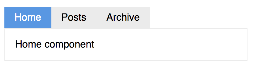
As an example we use a tab navigation where the content of a tab is rendered dynamically.
Let's start with the tab content:
Vue.component('tab-home', {
  template: '<div>Home component</div>'
});

Vue.component('tab-posts', {
  template: '<div>Posts component</div>'
});

Vue.component('tab-archive', {
  template: '<div>Archive component</div>'
});
I'm using a common name prefix tab- here to make it easier to lookup these components later.
Now, to render the component dynamically we use the <component> tag and give it a name via the is prop:
<component is="tab-home"></component>It is that simple! Vue then lookups the component referenced by that String and renders it in place of the <component> tag.
Now, this example is still static, let make it more dynamic. First we need to manage all our tabs in the Vue.js app:
new Vue({
  el: '#demo',
  data: {
    currentTab: 'Home',
    tabs: ['Home', 'Posts', 'Archive']
  },
  computed: {
    currentTabComponent: function () {
      return 'tab-' + this.currentTab.toLowerCase()
    }
  }
});
We use the tabs for the list of all tabs we want to render and the currentTab to maintain the selection. The actual component's name is concatenated as a computed property currentTabComponent.
Next we look into the markup to render the tabs:
<div id="demo">
  <ul class="tab-list">
    <li
      v-for="tab in tabs"
      :key="tab"
      >
      <a
        :class="['tab', { active: currentTab === tab }]"
        @click="currentTab = tab">

      </a>
    </li>
  </ul>

  <component
    :is="currentTabComponent"
    class="tab-content">
  </component>
</div>
You can find the complete example on GitHub
We use a v-for directive to render a list of tabs using the currentTab to set the active class. The @click event is used to change the currentTab state. Clicking on a tab will change the background-color to visually indicate the active state.
The <component> uses the currentTabComponent computed property to render the active tab content.
Note, how it passes along the class prop to the actual component it renders. Nice!
Summary #
The <component> tag is quite a powerful feature and in some use cases it might be easier to use instead of slots and custom code.